You know the feeling. You buy a sweater because it looks beautiful on the model, take it home, put it on, and suddenly you look like you haven’t slept in three days. The same sweater, same person, completely different result. That’s not bad luck, that’s color theory working against you instead of for you.
This is exactly the problem color analysis was created to solve. It’s the practice of figuring out which colors make your skin glow, your eyes pop, and your whole face feel revived and awake, versus which ones quietly wash you out. It’s having a moment right now on TikTok and Pinterest, but the actual method has been pioneered over many decades by stylists, image consultants, and costume designers. It’s not a trend. It’s a tool.
But what’s changed isn’t the science, it’s the accessibility. A process that once lived exclusively in $300 studio sessions with professional colorists now has enough free information online that anyone can get most of the way there from their bedroom. That’s part of why searches for color analysis have exploded over the past couple of years: people finally realized they didn’t need to guess anymore.
In this guide, we’re going to break down exactly how color analysis works, what the 12 seasons actually mean, how to know if you’re warm or cool, and how to pick your own palette, whether you’re doing it yourself at your kitchen table or booking a professional session. By the end, you’ll have a real, usable starting point instead of a vague feeling that “I look better in some colors than others.”
What Is Color Analysis, Actually?
At its core, color analysis is the practice of matching colors to your natural coloring, your skin’s undertone, your eye color, and your natural hair color, so that clothing, makeup, and accessories work with your features instead of competing against them.
The idea stems back to Johannes Itten, a color theorist at the Bauhaus school in the 1920s, who noticed that his students naturally gravitated toward color palettes that matched their own coloring. And years later, image consultants adapted his theory into the four-season system (spring, summer, autumn, winter), leading eventually to the more precise 12-season model most stylists use today.
Here’s the part people miss: this isn’t about “flattering” you in some vague, subjective sense. It’s about physics. Certain colors reflect light up into your face in a way that brightens your complexion and makes your eyes look clearer. The wrong colors do the opposite, they pull visual attention to shadows, dark circles, and uneven tone. A proper color analysis session identifies which effect a given shade has on your specific coloring.
This is also why two people can wear the “same” red and get completely different results. A true red with cool, blue undertones will make a cool-toned complexion look vibrant and awake. Put that exact same red near a warm-toned face, and it can clash with the skin’s natural golden or peachy cast, creating a subtle but real sense of imbalance— even if you can’t articulate why something looks slightly off. Color analysis gives you the language and the framework to explain what your eye has probably already noticed for years.
Warm vs Cool Skin Tone: The Foundation of Everything

Before you can find your season, you need to understand the single biggest variable in the whole system: warm vs cool skin tone.
Your skin’s undertone is different from your surface skin color. Two people with the exact same depth of tan can have completely different undertones; one warm, one cool, and that’s what determines which colors work.
A few reliable ways to check:
- The vein test. Look at the veins on the inside of your wrist in natural light. Greenish veins usually point to a warm undertone. Blue or purple veins usually point to cool. If you genuinely can’t tell, you might be neutral.
- The jewelry test. Hold gold and silver jewelry up to your face. If gold makes your skin look richer and healthier, you likely lean warm. If silver makes you look brighter and cleaner, you likely lean cool.
- The white vs cream test. Hold up a pure white t-shirt, then a cream or ivory one. Cool undertones typically look better in true white; warm undertones typically glow more next to cream and ivory.
- The sun test. Do you tan easily and rarely burn? That leans warm. Do you burn before you tan, especially without SPF? That leans cool.
None of these tests is perfect on its own, which is exactly why professional analysts use draping, holding actual fabric swatches against your face in neutral lighting and watching how your skin, under-eye area, and overall vibrancy respond in real time. It’s the most reliable method because it removes guesswork and shows you the effect, not just a theory.
The 12-Season Color Analysis System, Explained
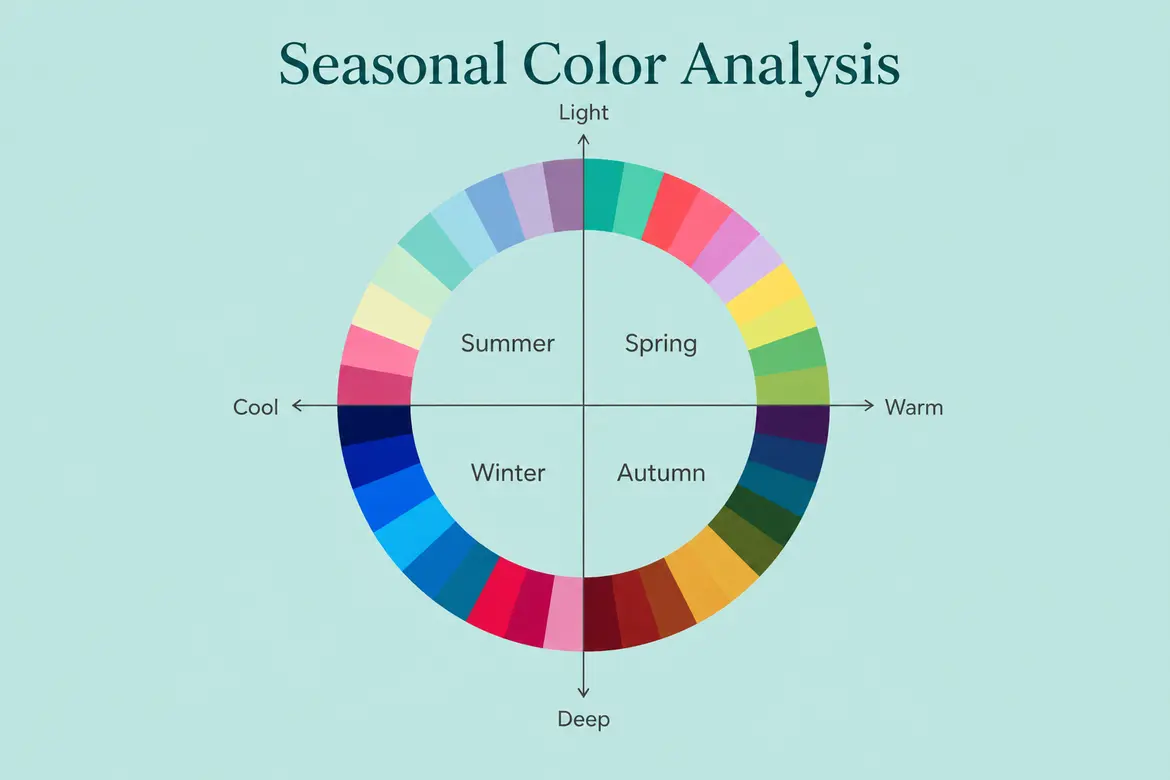
The original four-season model was a great start, but it was too broad, plenty of “winters” have almost nothing in common with each other. The 12-season system fixes that by adding three dimensions to every season: hue (warm or cool), value (light or deep), and chroma (bright/clear or soft/muted).
Here’s how the twelve break down, grouped by their parent season.
Spring Family (Warm + Light/Bright)
- Light Spring: warm, light, and delicate. Think soft peach, light coral, warm ivory.
- True Spring: warm and clear. This is the most saturated warm palette: golden yellow, warm turquoise, coral.
- Bright Spring: warm but leaning toward high clarity, closer to Bright Winter in intensity but still warm-based.
Summer Family (Cool + Light/Soft)
- Light Summer: cool and soft, low contrast. Powder blue, soft rose, dusty lavender.
- True Summer: cool and muted. This is the classic “cool girl” palette: soft blues, mauve, dusty rose.
- Soft Summer: the most muted palette overall. Cool-neutral, low chroma. Sage, taupe, muted plum.
Autumn Family (Warm + Deep/Soft)
- Soft Autumn: warm-neutral and muted. Camel, olive, soft terracotta.
- True Autumn: warm and richly saturated. Rust, mustard, pumpkin, forest green.
- Deep Autumn: warm and deep, the most intense of the autumn group.
Winter Family (Cool + Deep/Bright)
- Deep Winter: cool and very deep. Black, deep burgundy, emerald.
- True Winter: the purest cool palette, high contrast, jewel tones: sapphire, true red, icy white.
- Bright Winter: cool but extremely clear and vivid. Hot pink, electric blue, true black-and-white contrast.
If that felt like a lot, you’re not wrong, it is. But most people can narrow themselves down to one “family” fairly quickly using the warm/cool test above, and then refine from there based on depth and clarity.
Deep Autumn Color Analysis: A Closer Look
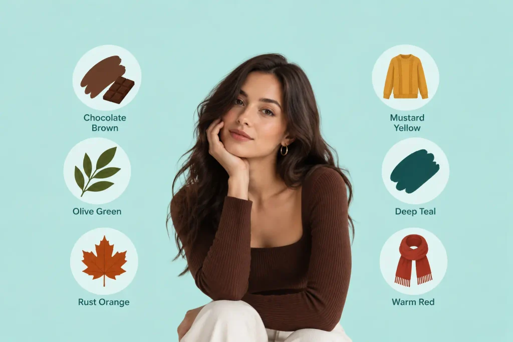
Deep Autumn deserves its own spotlight because it’s one of the most misunderstood, and most searched, seasons in the entire system.
Deep Autumns have warm undertones combined with deep natural coloring: think dark brown or black hair, deep brown or hazel eyes, and skin that can range from fair-with-warmth to deep and richly pigmented. The mistake a lot of Deep Autumns make is assuming that because they run warm, pastel and light colors are automatically “their season.” They’re not. Deep Autumn is defined by depth as much as warmth, which means pale, washed-out shades tend to flatten the face rather than brighten it.
Deep Autumns tend to look best in:
- Rich chocolate brown, chestnut, and espresso
- Deep olive and forest green
- Burnt orange, rust, and terracotta
- Deep mustard and burnished gold
- Dark teal and deep petrol blue
- Deep, warm reds like brick or tomato
Colors to be cautious with: icy pastels, cool baby pink, and stark black-and-white combinations, which can visually overpower or flatten a Deep Autumn’s natural warmth and richness.
If you’ve ever felt like “autumn” colors on Pinterest moodboards look beautiful on other people but slightly dull on you, there’s a good chance you’re not a soft or true autumn, you may need more depth, which is exactly what this specific subtype delivers.
How to Find Your Color Season at Home
You don’t need a $300 consultation to get a solid starting point. Here’s a practical, step-by-step approach:
1. Get into natural light with a bare face. No makeup, no filters, no warm indoor bulbs. Sit near a window during the day, this is non-negotiable, because artificial lighting will lie to you.
2. Pull your hair back and use a plain white cloth as a backdrop. You want your skin, eyes, and natural hair color to be the only variables in the frame.
3. Test warm vs cool first. Use the vein, jewelry, and white-vs-cream tests above. Look for a pattern, not a single perfect result.
4. Drape actual fabric or clothing near your face. Hold up different colored tops, scarves, or even paint swatches from a hardware store. Watch what happens to the skin under your eyes and along your jawline. Flattering colors tend to make shadows disappear and your eyes look brighter. Unflattering ones tend to highlight redness, dullness, or tiredness.
5. Determine your depth and clarity. Are your natural features (hair, eyes) high-contrast against your skin, or low-contrast and blended? High contrast usually points toward winter or true seasons. Low contrast usually points toward summer or soft seasons.
6. Cross-reference with the 12 descriptions above. By this point you should be able to land on one or two likely seasons.
7. Consider a professional session for confirmation. At-home analysis gets most people 70–80% of the way there. A trained analyst, using calibrated lighting and hundreds of draping swatches, can pinpoint the remaining nuance, especially if you land between two seasons, which is common and totally normal.
If you do decide to book a session, prices typically range anywhere from $75 for a virtual consultation to $300+ for an in-person appointment with a full swatch kit and takeaway guide. It’s worth it if you shop often, work in an industry where appearance matters professionally, or simply want the certainty of a trained eye confirming what you’ve worked out on your own. For most people, though, a careful DIY process using the steps above is genuinely enough to start shopping smarter immediately.
Best Colors for Skin Tone: Quick Reference
If you just want a fast cheat sheet before diving deeper, here’s a simplified breakdown by undertone and depth.
| Skin Tone Profile | Best Colors | Colors to Approach Carefully |
| Warm + Light | Peach, coral, warm ivory, light gold | Stark black, icy jewel tones |
| Warm + Deep | Rust, chocolate, mustard, deep olive | Pastel pink, icy blue |
| Cool + Light | Powder blue, soft rose, lavender | Orange, mustard, warm brown |
| Cool + Deep | Sapphire, emerald, true red, black | Warm beige, orange-red |
| Neutral | Soft teal, dusty rose, camel, navy | Extremely saturated neon shades |
The table is a shortcut, not a substitute for the full process but it is at least a starting point in a fitting room when you are looking to make a quick decision.
Color Analysis vs Personal Styling: What’s the Difference?
These two words are used interchangeably online, but those are different problems.
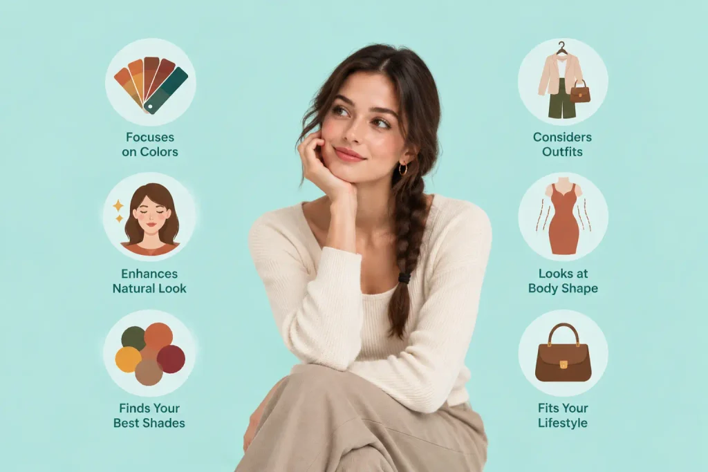
Color analysis is entirely about color, the colors which give your natural color its healthiest and most vibrant look. It does not touch silhouette, fit, proportion, or personal taste.
Personal styling is the bigger umbrella. A stylist looks at your body shape, lifestyle, budget, your clothes, and personal aesthetic, and color is a factor in that equation.
Think about it this way: color analysis tells you what shade of green will work for you. Personal styling tells you if that green should be a blazer, a slip dress, or a pair of trousers and how to build an outfit around it. And a lot of people start with color analysis because it’s a fast, tangible win, and then move into broader styling work once they know their palette.
Common Mistakes People Make With Color Analysis
- Testing under yellow indoor lighting. This distorts undertones almost every time. Natural daylight is critical.
- Judging on makeup and not skin. Foundation, bronzer, and blush can mask your true undertone. Test with a bare face.
- Assuming warm/cool is determined by ethnicity and skin depth. Undertone is independent of light or dark skin; people of every skin depth can be warm, cool, or neutral.
- Overcomplicating it from the first day. You don’t have to get the right one-of-twelve season right away. Start with warm vs cool and narrow from there.
- Treating it as a rulebook instead of a tool. Color analysis is not meant to make you feel that you have a limited set of colors to wear but rather to heighten your confidence. If you love a color that is not from your palette, take it off of your face in shoes or bags and wear it closer to your neckline and face.
- Skipping the eyes and hair. Most people look at skin and forget that eye color and natural hair color are just as important in the whole read. A person with striking blue eyes might test warm on the skin tests, but a darker palette may still present those eyes as the focal point of an outfit.
- How you compare yourself to influencer results. Lighting, camera filters, and editing can all play a big role in how a “reveal video” looks online. Use these videos for inspiration and general education, not as a literal benchmark for your own results, since your in-person coloring will always be the most accurate source of truth.
For the first time, give yourself permission to get it slightly wrong. Color-wise, most people who do color analysis seriously go through a rough draft of their season, go through a rough draft of what they think looks good in real-world lighting, and wear it for a few weeks and then adjust based on what they think is good in the real world (not just the mirror at home).
Final Thoughts
Color analysis isn’t about restricting yourself, it’s about finally understanding why some outfits have always made you feel incredibly put-together while others left you looking for concealer. Once you know if you’re warm or cool, and how light, deep, bright, or muted your natural coloring is, shopping gets quicker, getting dressed easier, and the guesswork disappears.
Start with the at-home tests. Notice the pattern. And if you want the whole thing, a professional draping session will take you the rest of the way.
Frequently Asked Questions (FAQs)
Q. How do I know if I’m warm or cool toned?
Ans. Check your wrist veins (green leans warm, blue leans cool), try gold vs silver jewelry against your skin and see whether cream or true white looks brighter on you. If results are mixed, you may be neutral, which is common and simply means you have more flexibility with color choices.
Q. What are the 12 seasons in color analysis?
Ans. Light Spring, True Spring, Bright Spring, Light Summer, True Summer, Soft Summer, Soft Autumn, True Autumn, Deep Autumn, Deep Winter, True Winter, and Bright Winter, each characterized by an undertone (warm/cool), depth (light/deep), and clarity (bright/muted).
Q. Is color analysis the same as personal styling?
Ans. No. Color analysis is only about the color that suits your natural coloring. Personal styling is much more than that, silhouette, proportion, lifestyle, personal taste, and color is just one aspect.
Q. Do I have to do color analysis myself or do I need to hire a professional?
Ans. You can get a good starting point at home with natural light, vein/jewelry tests, and basic draping with fabric or clothing. A professional session on color analysis is more precise, particularly when you are in between two seasons, but you can start making better color choices right away.
Q. What is Deep Autumn color analysis?
Ans. Deep Autumn describes a warm undertone and deep natural coloring, most often dark hair and eyes. Deep Autumns do best in rich, warm, saturated shades like chocolate brown, rust, and deep olive, not light pastels that wash out their natural depth.