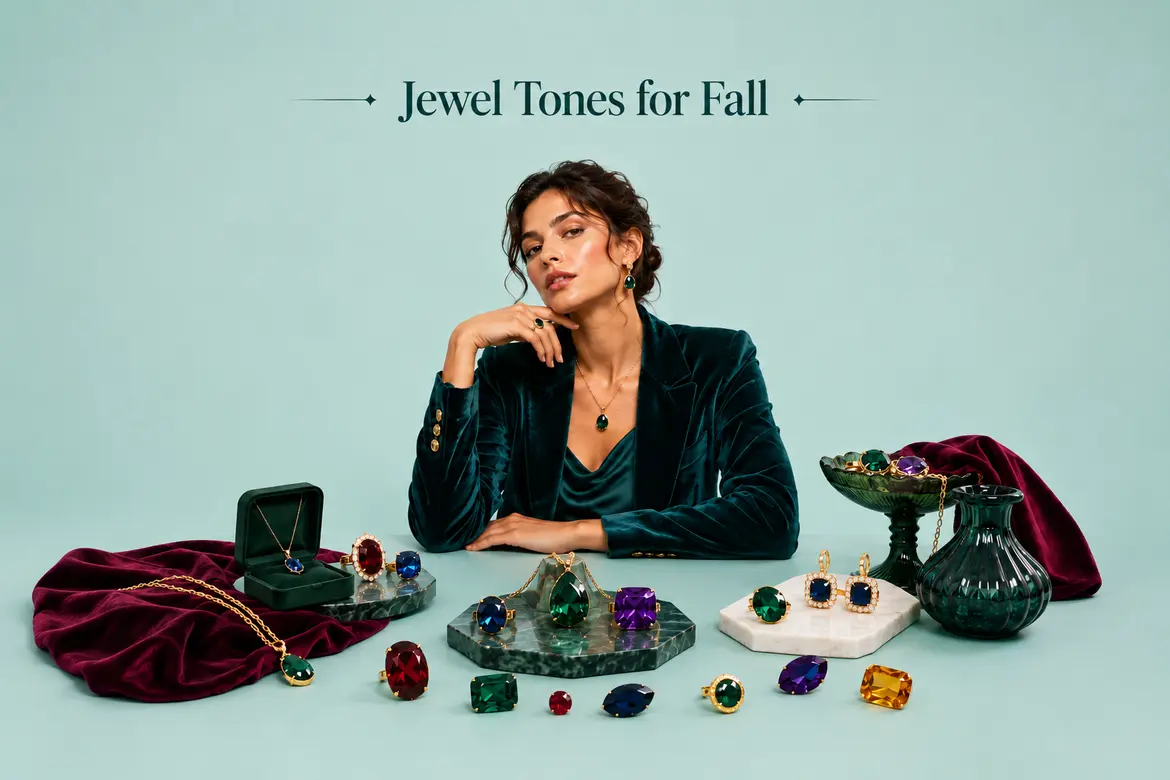
Every autumn, when the light changes and your whole wardrobe suddenly feels wrong, you reach for something with weight to it. This year, that something has a name, and it is jewel tones. The linen looks thin. The pastels look nervous. Burgundy, mulberry, and plum have taken over the fall 2026 runways, the resort collections, and roughly half of my saved folder on Instagram, and they are the reasons I finally retired the beige coat I bought three winters ago and never loved.
I want you to understand what these colors are, how they read as expensive, and how to wear them without feeling like you raided a Renaissance painting. This is your field guide to the richest palette of the season.
What Are Jewel Tones, Exactly?
Jewel tones are colors named after gemstones. Sapphire blue, emerald green, ruby red, amethyst purple, garnet, and topaz. The list reads like the inside of a jewelry box, which is the whole point. These are saturated, deep, pigment-heavy shades that carry a sense of depth you can almost feel.
Here is the technical part that matters. Color has three properties: hue, tone, and saturation. Hue is the color itself, red or blue or green. Tone is how light or dark it is at the surface of the color. Saturation is how pure and intense a color is, essentially how much gray sits underneath it. Jewel tones have high saturation levels and settle in the medium-dark range on tone. They contain a lot of pigment and reflect little light, so when they hit velvet or silk, they have that almost glowing, inward quality.
That low light reflectance is why a burgundy dress looks costly under a dim restaurant bulb and a bright coral would look flat. The color absorbs light rather than bouncing it back at you. Designers have relied on this for centuries, since richly saturated dyes were historically rare and expensive, tied to the wealth and status of whoever wore them.
One thing to know: a jewel tone doesn’t need a matching gemstone. A saturated fuchsia or a deep navy can be a jewel tone even without a stone behind the name. Push almost any color to a high enough saturation and enough depth, and it belongs in the family.
The Jewel Tones Color Wheel: Where These Shades Live
People assume jewel tones cluster in one corner of the color wheel. They don’t. Emerald is in the greens, sapphire in the blues, and ruby in the reds. What unites them is saturation and depth, not position on the wheel. So when someone talks about a jewel tones color wheel, they’re really talking about the whole ring at high pigment, with one deep gemstone shade representing each hue family.
This matters for the fall trio. Burgundy, mulberry, and plum sit in the red-purple slice of the wheel, which is why they sync together so effortlessly. Burgundy is red with a little brown undertone. Plum shifts toward purple. Mulberry sits between them, a red-purple with a berry-stained quality. Because they’re neighbors on the wheel, they read as a considered palette rather than a random assortment.
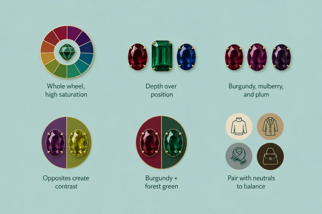
For contrast, look directly across the wheel. Plum’s opposite lies in the yellow greens, which is why chartreuse and olive keep popping up alongside these colors on the runway. Burgundy and forest green flatter each other for the same reason. A little of the opposite color makes a jewel tone look richer, not louder.
Here’s a simple way to use the wheel without overthinking it:
- Analogous (neighbors): burgundy, mulberry, and plum together, layered tonally for a quiet, expensive look.
- Complementary (opposites): plum with chartreuse, or burgundy with olive, for a bit of contrast.
- Neutral anchor: any jewel tone with cream, camel, grey, or chocolate brown to calm the whole thing down.
Jewel Tones vs. Earth Tones and “Dark” Colors
A lot of confusion here comes down to one mistake many people make: treating “deep” and “dark” as the same thing. They aren’t. A dark color is any color with black added, which mutes it. Burgundy is a jewel tone, a saturated color at a medium-dark tone that keeps the pigment alive. A muddy oxblood-brown, by contrast, is simply a dark color. The difference is how much life stays in the shade.
Earth tones trip people up too. Rust, terracotta, olive, and mustard are warm and muted; their character comes from soil and clay rather than gemstones. Jewel tones come from the opposite direction: cut stone, high chroma, and a cool sheen even in the warmer shades. The two families mix well in an outfit, which is why olive and burgundy look so good side by side, but they’re doing different jobs. Earth tones ground a look. Jewel tones lift it.
Having a sense of what you’re after saves you money at the shops. If a “burgundy” sweater looks flat and brownish on the hanger, it’s slipped into earth-tone territory and won’t give you the richness you came for. Hold it up to the light: a true jewel tone glows a little, while a dark or earthy shade just sits still.
The Fall Jewel Tones Everyone Is Wearing
Deep wine tones, berry-infused reds, and moody purples have been showing up across trend forecasting and resort collections for the 2026 season, with jewel shades appearing across labels including Louis Vuitton, Dior, and Fendi, while Balenciaga and Givenchy leaned into wine and berry shades of their own. (Worth noting: not every major color authority is pointing in the same direction this year, Pantone’s actual 2026 Color of the Year is Cloud Dancer, a soft, airy white, a reminder that “jewel tones” is one strong seasonal current among several, not a universal consensus pick.) If you’ve felt like the shops suddenly went dark and rich, you weren’t imagining it, even if the picture varies depending on which forecaster you check.
Three shades are leading the pack this fall. Here’s how they differ and how to tell them apart in a shop when the labels all say something vague like “wine.”
Burgundy
Burgundy is the anchor of the season and the one your wardrobe probably already knows. It’s a deep red with a brown undertone, which is what makes it function almost like a neutral. This year the conversation has shifted toward a warmer burgundy, with enough brown in it to sit next to camel, tan, and chocolate the way navy sits next to everything. That warmth is the update. The cooler, wine-purple burgundies of a few seasons back have stepped aside.
Wear burgundy as your grounding piece: a pair of oxblood leather boots, a chunky burgundy knit, and a leather bag in the same shade. It does the job of Black, but with more life in it.
Mulberry
Mulberry is the sleeper hit and the hardest of the three to pin down. Picture a berry crushed into silk. It carries more pink and purple than burgundy, but it’s soft and muted rather than bright, giving it a bruised, romantic quality. Mulberry flatters a huge range of skin tones because it’s neither icy nor overly warm, and it photographs well in autumn light.
This is the shade to reach for when burgundy feels too safe and plum feels too bold. A mulberry scarf or a fine-gauge sweater sits in the sweet spot between the two.
Plum
Plum is burgundy’s more purple, more playful cousin. Where burgundy pulls brown, plum pulls violet, which makes it read fresher and a touch more modern. A dusty plum reads as a jewel tone without shouting, and it slips under a tuxedo blazer or over a pair of jeans with equal ease.
If you want one statement piece this fall, a plum coat is the pick. It brings vibrancy to an otherwise neutral outfit and does most of the styling work for you.
| Shade | Undertone | Mood | Pairs Well With | Approx. Hex |
|---|---|---|---|---|
| Burgundy | Brown-red | Grounded, classic, neutral-adjacent | Camel, cream, olive, chocolate | #800020 |
| Mulberry | Berry, soft pink-purple | Romantic, muted, easy | Grey, blush, denim, silver | #77435C |
| Plum | Purple-violet | Fresh, modern, a little bold | Chartreuse, black, denim, camel | #8E4585 |
If those hex values feel like ballpark references, take them as ballpark references. Every brand mixes its own version, and “plum” on one label can look like “mulberry” on another.
Building a Jewel Tones Color Palette That Works
A single jewel tone is easy. The trick is combining them with the rest of your closet so the outfit reads as composed, not costume. A good jewel-tone color palette comes down to one principle: let the rich color lead, and let a neutral or a small contrast make up the rest.
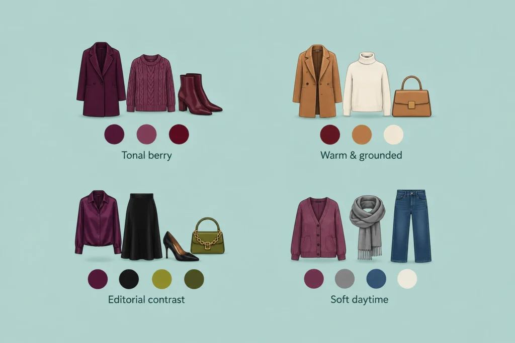
A few palettes worth returning to this season:
- Tonal berry: burgundy, mulberry, and plum in different weights, a plum coat, a mulberry knit, and burgundy boots. It reads as intentional because those three shades are neighbors on the wheel.
- Warm and grounded: warm burgundy with camel and cream. This is the closest thing to a fall uniform, and it works for the office without trying.
- Editorial contrast: plum with black and a single accent of chartreuse or olive. Best for evening, or whenever you want to look a little sharper than the room.
- Soft daytime: mulberry with grey and denim. Grey is quietly taking over from brown as the season’s go-to neutral, giving a berry tone room to breathe.
Velvet deserves a mention here. Because velvet absorbs light, it makes any of these colors look deeper and more expensive than the same shade in cotton. A velvet blazer in plum or a burgundy velvet trouser is the shortcut to the whole trend in one garment.
Which Jewel Tone Colors Suit You?
This is the question I get most often, and the honest answer is that jewel tones suit more people than almost any other palette, because their depth mirrors natural contrast in the face rather than washing it out.
In seasonal color analysis, jewel tones belong to the Winter family. If you have cool undertones and high contrast between your hair, skin, and eyes, you can wear these at full saturation, and they’ll love you back. Sapphire, ruby, and emerald are your signature colors, with deep burgundy and plum right there alongside them.
If you fall into autumn, spring, or summer, you can still borrow from the family. Two easy adjustments:
- Soften the chroma. A muted mulberry or a dusty plum reads gentler against warmer or softer coloring than a saturated ruby would.
- Warm the undertone. Deep autumn types tend to do well with garnet and warm burgundy, since the brown undertone meets them halfway.
If you’re uncertain of your season, start where the risk is lowest: shoes, bags, and scarves. Accessories sit away from your face, so you get all the richness of the color without the guesswork of whether it flatters your complexion. A burgundy boot or a plum crossbody is a low-commitment way into the trend.
How to Wear Fall Jewel Tones Without Looking Overdone
The failure mode with jewel tones is wearing too many at once and ending up looking like a stained-glass window. A few guardrails keep the look modern:
- Start with one actual color piece. If you’ve been living in black and camel, a single plum coat or burgundy sweater is enough. You don’t need head-to-toe gemstone.
- Anchor with a neutral. Cream, grey, camel, and chocolate calm a saturated color. Grey is especially relevant this season and lets the color do the talking.
- Use texture as a multiplier. Velvet, satin, and fine knit all deepen these colors. A matte cotton plum can look chalky, while a velvet plum looks luxe.
- Add one contrast, not five. A flash of olive or chartreuse beside plum or burgundy sharpens the whole outfit. More than one contrast, and it starts to feel busy.
- Match your metals. Brass and gold hardware, jewelry, and buttons accent jewel tones the way a bezel flatters a stone. Silver works too, especially with mulberry.
In the office, a plum or burgundy velvet blazer over tailored trousers is close to a uniform this fall. For evening, lean into velvet and satin and let low light do what it does best with these shades. For weekends, one jewel-tone piece over jeans is enough. If you’re building this into a broader, more considered wardrobe rather than chasing every trend, it’s worth reading about quiet luxury fashion alongside this, since the two philosophies pair naturally: rich color and restrained execution.
Beyond the Closet: Jewel Tones at Home
The trend hasn’t stayed in wardrobes. Several home and interior brands have pointed toward deep purples and richer, more textured palettes for 2026, part of a broader move away from the “sad beige” era toward more depth and warmth. You don’t need to repaint anything to join in. A couple of burgundy or plum velvet cushions on a neutral sofa bring the palette home, and they’re easy to swap out come spring. A plum or oxblood throw over a chair does similar work with even less effort. Brass accents, a mirror frame, or a lamp base pull the whole thing together, since warm metal and jewel tones have always flattered each other.
Jewel Tones in Your Makeup Bag
The palette works on your face as well as your body, and it’s the lowest-stakes way to test whether a shade suits you before you commit to the coat. A plum lip is one of the most flattering fall makeup moves around. It reads as a step up from your everyday nude without the commitment of a bright red, and it flatters warm and cool skin alike, since you can pick a version that leans either way.
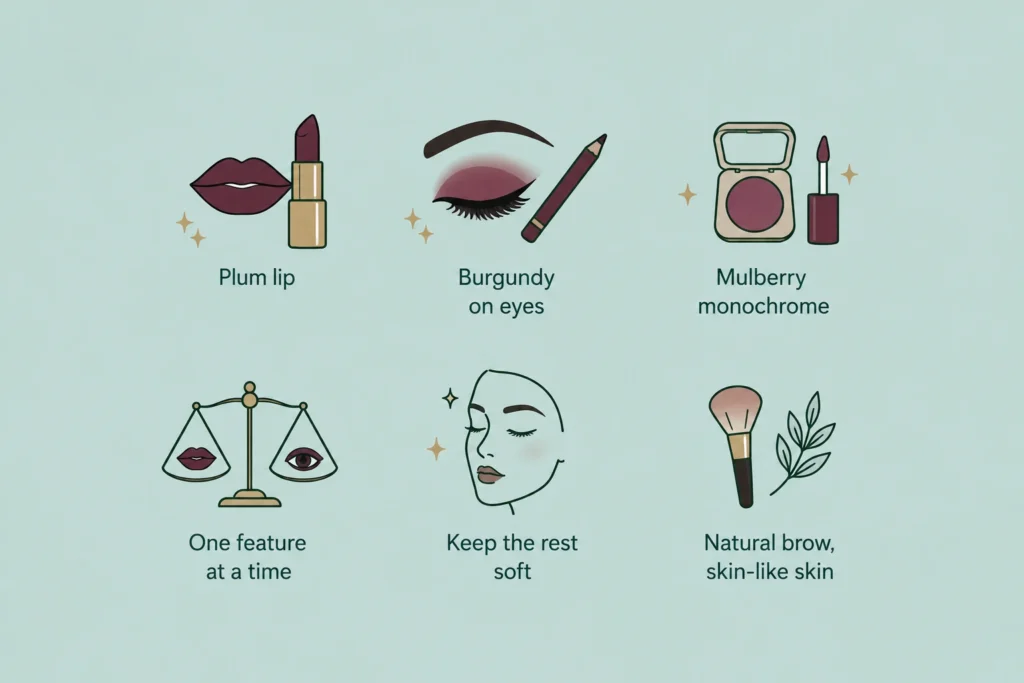
Burgundy has moved onto eyes this season. A soft, smudged burgundy liner or a wash of wine-toned shadow warms up the whole eye and tends to photograph better than black in autumn light. Mulberry sits somewhere in between, a gorgeous monochrome blush-and-lip pairing for days you want to look put together in three minutes flat.
Two small rules keep jewel-tone makeup from tipping into “costume.” Pick one feature to carry the color, either the lip or the eye, not both at full strength, and keep the rest of the face soft, with a natural brow and skin that looks like skin. The color should feel like the richest thing you’re wearing, not the loudest.
Your First Three Jewel Tone Buys
If you’re building into the trend rather than overhauling everything at once, buy in this order. Each piece earns its place and pairs with what you already own.
- A pair of shoes or boots in burgundy or oxblood. They sit away from your face, so flattery isn’t a worry, and they slot under jeans, trousers, and dresses you already have. This is the safest first spend of the season.
- One statement outer layer in plum. A plum coat or a velvet blazer does most of the styling for you and turns a neutral outfit into an outfit. If you buy one trend piece this fall, make it this.
- A soft mulberry knit or scarf. The bridge shade. It softens burgundy, calms plum, and works on its own with grey or denim on the in-between days.
Skip, for now, the head-to-toe jewel-tone set unless you already love the look; it’s the fastest way to overspend on a trend you might tire of by March. Three considered pieces will carry you through the whole season and past it.
Myth vs. Reality
| The Myth | The Reality |
|---|---|
| Jewel tones only suit cool, high-contrast complexions. | Everyone can wear them; softer colorings can choose muted versions like dusty plum. |
| You need to wear them head to toe. | One rich jewel-toned piece against a neutral is the modern way to wear them. |
| Jewel tones are strictly for fall and winter. | Burgundy, in particular, works year-round as a moody neutral. |
| Brighter equals more luxurious. | Depth and saturation, not brightness, are what create an expensive look. |
The Takeaway
Jewel tones earned their fall 2026 crown for a reason. They flatter almost everyone, they read as expensive without the price tag, and burgundy, mulberry, and plum give you a built-in palette that already harmonizes before you’ve styled a thing. Start with one piece, anchor it with a neutral you already own, and let the depth of the color do the rest. Come the first cold, grey afternoon, you’ll be glad you traded the nervous pastels for something with real weight to it.
Frequently Asked Questions (FAQs)
What are jewel tones in simple terms?
Jewel tones are rich, saturated colors named after gemstones, think sapphire, ruby, emerald, amethyst, and garnet. They’re deep and pigment-heavy, sitting in the medium-to-dark range with high saturation, which is what gives jewel tones colors that luxurious, glowing quality.
What are the main fall jewel tones for 2026?
Burgundy, mulberry, and plum lead the season, joined by punchier accents like mandarin orange and deep purple. Grey is rising as the season’s neutral of choice, taking over from brown as the shade these rich colors get paired against.
What is the difference between burgundy and plum?
Burgundy is a deep red with a brown undertone, which makes it behave almost like a neutral. Plum has a stronger purple undertone, so it reads more vibrant, fresh, and modern. Mulberry sits between the two, a soft berry shade with both pink and purple in it.
Do jewel tones suit everyone?
They suit more people than most palettes, because their depth mirrors natural facial contrast. Cool-toned winter types wear them at full saturation. Warmer or softer coloring can still wear jewel-tone colors by choosing muted versions like dusty plum or by starting with accessories that sit away from the face.
How do I build a jewel-tone color palette without it looking loud?
Let one rich color lead, then anchor it with a neutral like cream, grey, or camel. For contrast, add a single opposite shade, such as olive beside burgundy or chartreuse beside plum. Keep the jewel tones to one or two pieces and let texture, especially velvet, carry the richness.